← Back to portfolio
Product Strategy / UX

Engagement-First Dashboard Redesign

Chimple Learning · 2025

The organization had already validated its North Star Metric. The Teacher's App dashboard was still helping teachers make decisions using a different signal.

Context

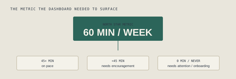
Chimple's North Star Metric is 60 minutes of student engagement per week. This metric had already been validated through a randomized controlled trial of the app before I joined the organization, so it was the metric the product was expected to optimize toward.

The problem was that the Teacher's App dashboard wasn't aligned with it.

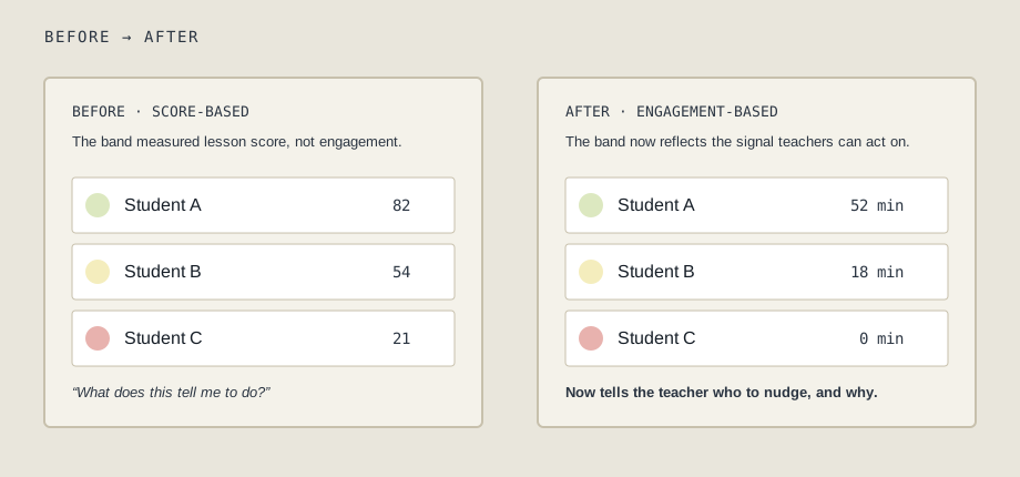
Teachers were shown red, yellow, and green bands for each student based on lesson scores out of 100. The weekly summary beside it had the same problem — it surfaced information, but it wasn't connected to the engagement metric the organization had already established as important.

More importantly, teachers told me they didn't understand what the bands meant or what they were supposed to do with them.
The problem

The dashboard was supposed to help teachers identify students who needed attention.

But a lesson score doesn't tell a teacher whether a student is building a regular learning habit. A student could score well on a lesson but still spend very little time learning each week.

We had already validated that 60 minutes of weekly engagement was the metric that mattered. Yet the dashboard was asking teachers to make decisions using a completely different signal.

Getting alignment

I raised this with my CEO and manager and made the case that the dashboard needed to be rebuilt around the North Star Metric rather than lesson scores.

If 60 minutes of weekly engagement is the metric we're trying to improve, teachers should be able to see and act on that metric directly.

Once we had alignment, I worked through what that should look like in practice. I didn't want to replace the existing bands with a simple active/inactive status. Teachers needed enough detail to distinguish between students who had no engagement at all and students who were engaging but were still below the weekly target.

What I shipped

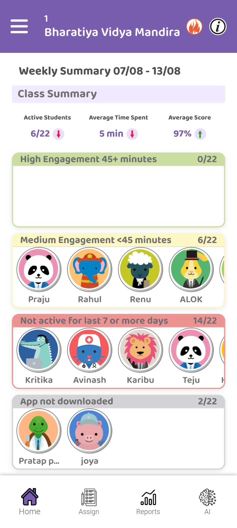
I redesigned and shipped the weekly class summary around rolling 7-day engagement data.

  • Active students
  • Average time spent
  • Average score

The student-level view moved from score-based bands to four engagement bands:

  • Green — 45+ minutes: students on pace toward the 60-minute weekly North Star.
  • Yellow — some engagement, but below 45 minutes: students who are active but may need additional encouragement.
  • Red — 0 minutes this week: students who had previously been activated but had no engagement during the current week.
  • Grey — no activity ever: students who had never played a lesson.

The same engagement data also fed into the leaderboard, creating consistency between the dashboard's diagnostic view and its motivational layer.

Teacher's App weekly class summary showing active students, average time spent, average score, and four student engagement bands.
The redesigned weekly class summary, with engagement replacing lesson score as the primary signal.
Result

The redesigned dashboard was fully shipped and is live.

I don't have a quantified adoption or behavior-change metric yet, so I wouldn't claim one here. The immediate outcome was that we removed a specific source of confusion for teachers and aligned the dashboard with the engagement metric the organization had already validated.

More importantly, the same engagement framework now powers both the teacher's diagnostic view and the leaderboard.

What I learned

This project reinforced something I now pay close attention to:

A North Star Metric only matters if the product surfaces around it help people act on it.

We had already done the difficult part — validating the 60-minute engagement metric through an RCT. But that learning wasn't reaching teachers through the product.

The solution wasn't another feature. It was making sure the people closest to the students were looking at the same signal the organization had decided mattered.

It also changed how I approach product disagreements. Instead of arguing that a dashboard should be redesigned because it “felt wrong,” I could connect the change directly to existing evidence: we know what metric matters, and our product isn't showing it.